When a visitor to your website completes your contact form, signs up to your newsletter or completes a sale through your online shop how do you thank them?
Do you offer up a generic Thank You page that ‘ends the conversation’ with them or do you make them feel like you’re incredibly grateful that they’ve taken the time to visit your website and interact with you? If it’s the former then you are missing a huge opportunity for further engagement with these people. A visitor who takes action on your site is very likely to return so why not make them feel like they’re truly valued by improving your Thank You page and continue building your relationship with them?
Here’s how we can all do better and why that’s important
“Thank You for your enquiry. We will be in touch shortly.” Really doesn’t cut it for me. And yet, that’s the best that the majority of websites I spend my valuable time visiting come up with. These throw away lines of copy don’t inspire me to continue doing business with the company and most often this page is a real disconnect from the rest of the website experience and the values of the company itself.
Worst of all, I never feel like I can trust that my enquiry has been received and on more than one occasion have picked up the phone to check! So rather than treating your Thank You page as an afterthought, below I offer some ways to improve the experience that your visitors (that I’m sure you’ve worked really hard to attract) have on your website.
Include your Thank You page as part of your overall website strategy
Think of this page as an opportunity to create an awesome first experience with your brand. Always remembering that a visitor that arrives at your Thank You page is the hottest lead you have – they’ve already taken action on your site and chances are they will again – give them another reason to do just that with a cleverly thought out Thank You page. And before you start thinking about what to include on this page ask yourself these two guiding questions:
- What do you want to achieve with your Thank You page
- What action do you want visitors to take next?
Here are some ideas that you could use on your Thank You page:
- Set an expectation
What’s the next step? How long until you will be in touch? When will the purchase be shipped? Putting a date or timeframe in here is critical – but make sure you have a process in place so that your staff exceed this expectation – there’s nothing worse than being excited by a 24 hour turnaround only to be disappointed when it takes a week. - Add your contact info
Sometimes your visitors might have an immediate question they need answered – make it easy for them to get in touch. - Use a strong Call to Action
Guide and entice your visitors to take another action – such as signing up to your newsletter or guiding them to specific pages on your site that build brand credibility such as testimonial pages or case studies. Remember they’re hot when they’ve just taken action so don’t lose the chance to keep them on your site for longer. - Encourage them to follow you on Social Media
Have quick and easily recognisable icon links to popular social media platforms. Having your website visitors following/interacting with you on other channels aside from your website is super powerful stuff – great for brand awareness and promotion. Plus ‘social proof’ of high volumes of social media followers makes you more ‘legit’ and credible. - Suggest they sign up for your newsletter
Being able to reach out to visitors with interesting newsletter content will keep them interested in your products and services and likely to take further action. - Show them your expertise (and therefore build trust further)
By including links to relevant or recent blogs/videos/whitepapers on your website.
And some ideas specifically for e-Commerce websites:
- This is the perfect place for up-sells or cross sells for online shops
- Invite new customers to create an account
Build your client base by inviting customers to create an account post sale. Just make sure you outline the benefits of doing so and you’ll find uptake to be high. - Offer promotional codes
Strike while the iron is hot and suggest the next sale by giving a promo code for their next purchase – make sure the offer is relevant to their purchase and time-bound to encourage action.
Where ever possible get a little creative with the design of this page – show some personality and get them thinking.
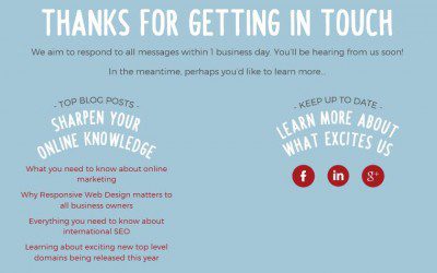
Here’s what the Apex Digital Thank You page looks like for our contact form:

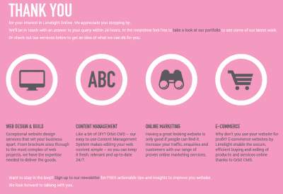
And what the Limelight Online Thank You page looks like:

We’ve incorporated many of the ideas above that are relevant to the type of enquiry.
The last part of the equation for creating effective Thank You messages for your site visitors is to
Use an auto-response email
Build up trust by setting up an automatic email to be sent to your visitor’s inbox to let them know that yes, you have received their enquiry or sign up request. If you have an online shop then I’d expect you’re already doing this to confirm their order. The copy of this email is of equal importance to the Thank You page – make sure it is consistent with the messages you use on this page with the keys goals of
- making the visitor feel that they’ve been acknowledged
- setting an expectation of when they can expect a response from you
- making it easy for them to get in touch if they have a query
- enticing them back to your website to take further action.
I hope you can take away some ideas to improve the Thank You pages on your website. If you have any other tips or advice or examples of websites that are doing a great job with their Thank You pages (your own perhaps?) please post them in the comments below – I’d love to hear from you.
