
Last month we gave tips on how to create the perfect product category pages for your eCommerce website. Now, let’s talk about the principles of building the perfect product page to help your site visitors (and search engines like Google) take action.
A product page is the crux of the customer journey — it’s the precise point when visitor’s decide to ‘add to cart’, or not. This in mind, it’s so important to not neglect the minutiae and instead provide as much useful information about your product as possible.
So, what should the key visual characteristics of your product page be?
Here, we look at specific product page features you should consider when building your website.
Product Name
Be as descriptive as possible, including attributes that allow potential customers to make quick decisions and compare multiple products when viewing your category pages.
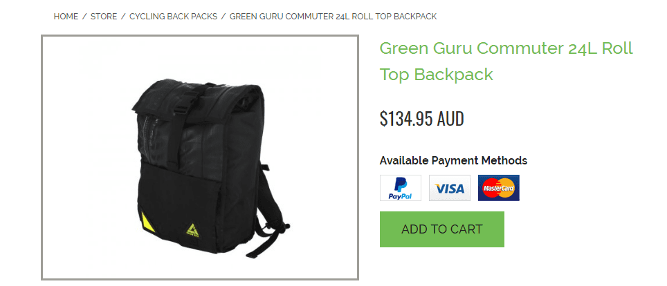
The product name also helps search engines quickly understand what content the product page contains so it can return results relevant to users’ search queries. Here’s a great example of a distributor utilising brand name, size and an attribute in the product name:
Price
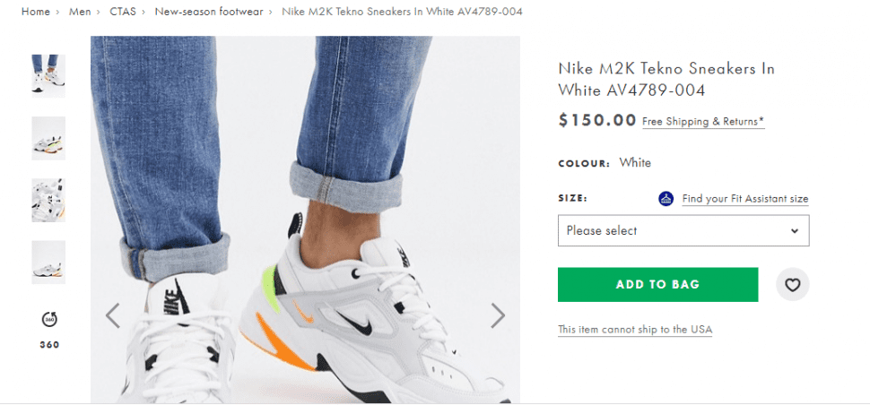
Online shoppers, especially, are driven to make purchases based on price. Make sure the product price is prominently positioned and easy to read. Don’t hide it at the bottom of the description where it has to be searched for. The above screenshot is an example of a perfectly positioned product price.
Also, for discounted items make the reduction amount clear so that shoppers see how much they’re set to save.
Product Description
Before writing your product descriptions, it is critical that you understand your audience. If you remember the mantra, ‘it’s about them, not us’ when writing the descriptions (and most of the copy on your website for that matter!) then you’ll approach the task from the right angle and save a lot of rework.
The three key considerations are:
- What are the product benefits?
- Have you addressed potential objections?
- Have you answered your customer’s questions?
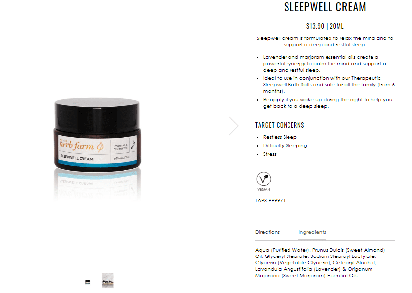
Note the way the following description does this. There’s no need to search for further information and even the directions for use and ingredients are provided.
Product Images
We discussed the importance of imagery in our post last month, and because we believe that your product images are the single-most important images on your website, let’s talk some more about them here.
Remember that consistency is key. Think about future proofing your website by using photographic techniques that you can easily recreate with the same background and perspective to ensure a professional look. Think about the images used throughout the site including the category pages and make sure you don’t deviate from the overall look and feel you’ve already created.
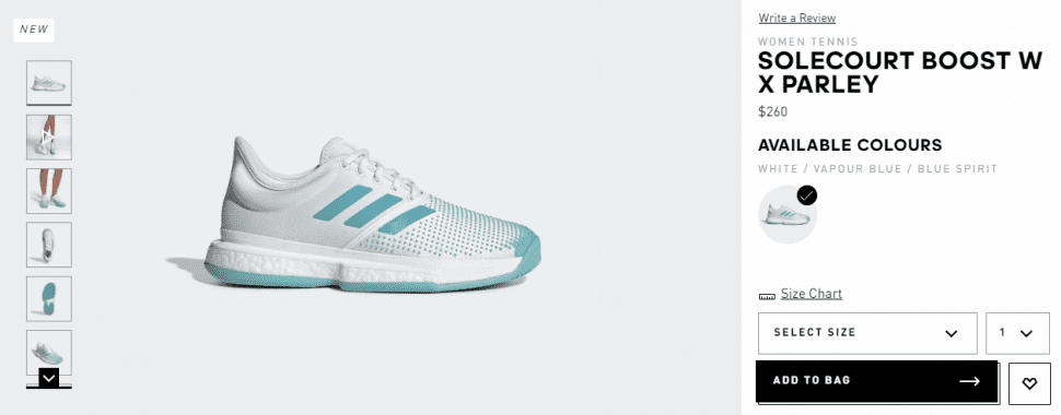
Remember also that your site visitors can’t touch and feel your product so provide plenty of angles and use other props (such as people wearing products) or show products in their natural context to show scale. Here’s a great example of product imagery from Adidas.
Product Video
Recent studies have shown that site visitors are 64-85% more likely to buy after watching a product video, so it’s really a no-brainer that your online shop should utilise this medium to promote your products. Make it clear that a video is available by either including it in your image carousel with a play button icon to distinguish it, or by making a prominent link to the video within the description.
Product Attributes
Be sure to show the specifications for your products — colour, size, measurements, material composition, etc. — and only show those that you have in stock (software that seamlessly connects your inventory levels with your website is key when selling large volumes of products).
Shipping and Delivery
Part of the purchase decision for many online shoppers is ‘how much is shipping going to cost me?’ and ‘what is the returns policy?’. If you offer free shipping, then say so in your product listing and make sure you link directly through to your shipping and returns policy. Here is an example of a site that does this well.
Add Your Call to Action (CTA)
Now that you’ve provided all your product information, you simply need people to make a purchase. Make it easy for them by providing a call to action button that is impossible to miss. We recommend keeping with well-known standard terminology such as ‘Add to Cart/Bag’ for best results.
Include Trust Signals
In order to buy from a website; visitors need to trust it first. Displaying applicable customer reviews (more about these below), money back guarantees, warranty information and affiliations/certifications/badges from third parties will contribute to building a trustworthy online presence.
Above all, make it clear that if your customers encounter any problems that you’ll fix them quickly and without fuss.
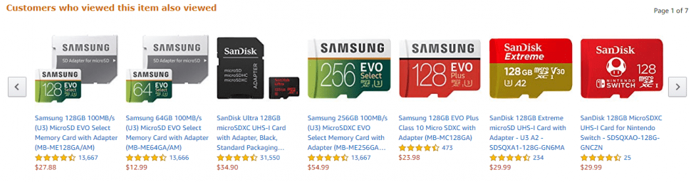
Product Comparisons
Showing comparative products you sell — and specifically those that others have purchased — can help you to gain a sales edge. Think of a bricks and mortar shop where similar products would be grouped together on shelves and show the best products that match your customer’s search.
Here’s an example from Amazon showing the first of seven pages of similar products.
Customer Reviews
The social proof garnered from showing product reviews can make or break a sale. As mentioned last month, reviews are essential for building trust and loyalty and helping your customers feel confident in their purchasing decisions. The more reviews you have on your site the more convinced a prospective customer may be that they’re making a good decision.
Finally, before we sign off, there are two further critical areas to consider:
- Don’t forget to give your product page titles and meta descriptions some love. As we mentioned last month, both help search engines determine the content of a page and also often appear in search results pages providing a chance to show users what a page is about before they click on the link. If you want to know more, take a look at our post on the perfectly optimised page for more ideas on how to boost your overall online visibility.
- Plus, remember to test, analyse and optimise your product pages using effective conversion rate optimisation techniques and make sure you have accurately attributed conversions to the correct channels to maximise ROI.
If you’d like any help with developing your eCommerce website or need assistance with writing product descriptions for your online shop, please don’t hesitate to contact us — we’d be happy to help.